People Inc. How We Give
Ellie’s role: Concept development & Graphic Design
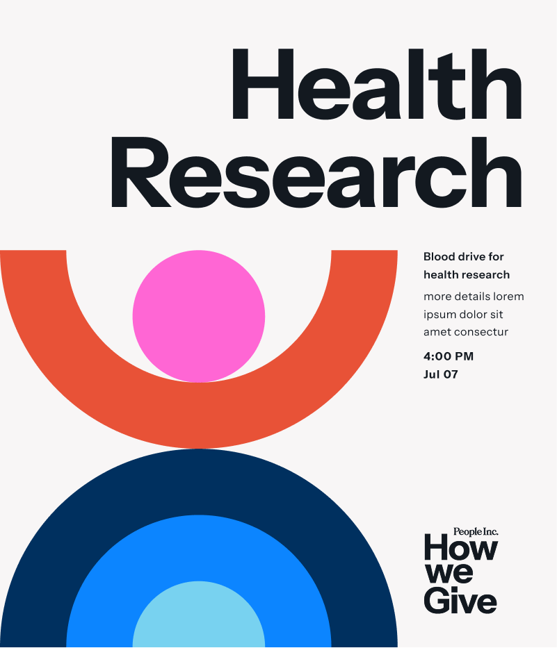
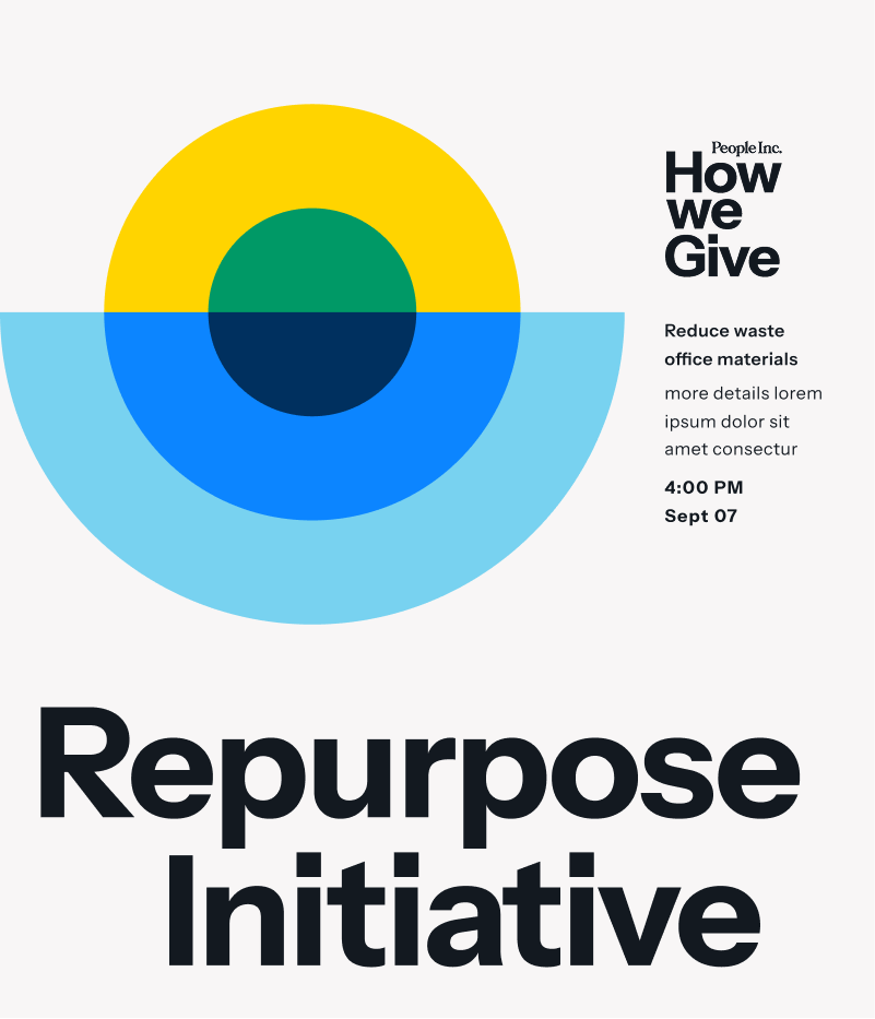
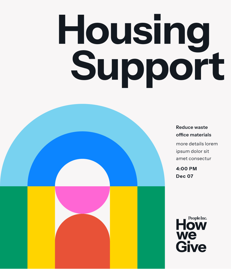


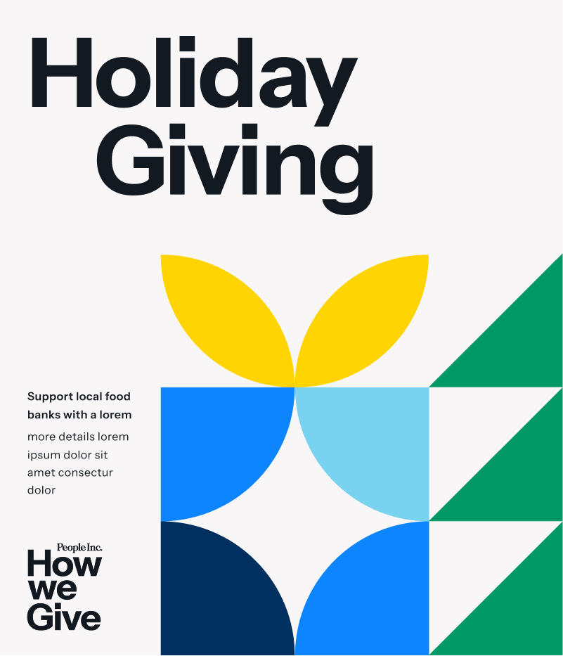

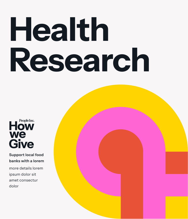
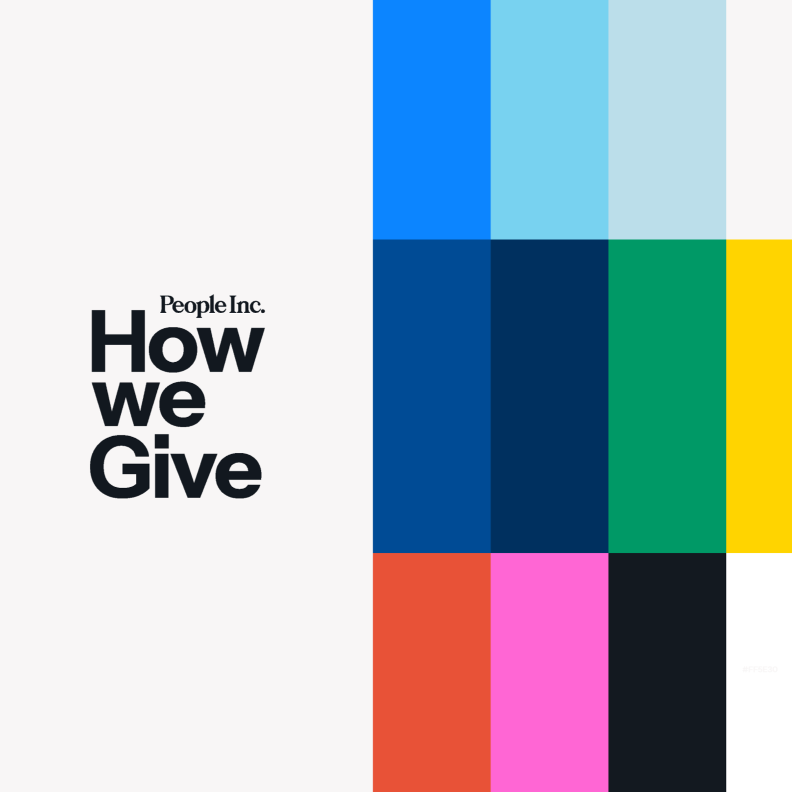
Using Bauhaus Grid
Bauhaus translates literally to “building house.” Bauhaus design is characterized by clean lines, simple, useful shapes, primary colors, and rational use of materials. How We Give branding draws from this focus on utility and solution-oriented design principles. Giving back should be depicted as an essential aspect of our basic existence, and carried out seamlessly rather than as a magnanimous or glorious act.
I began with sketches using our Dotdash Meredith original logo in the context of environmental geometric shapes. When the company rebranded to People Inc., we decided to use a simple lockup that would highlight the brand identity as part of the initiative.
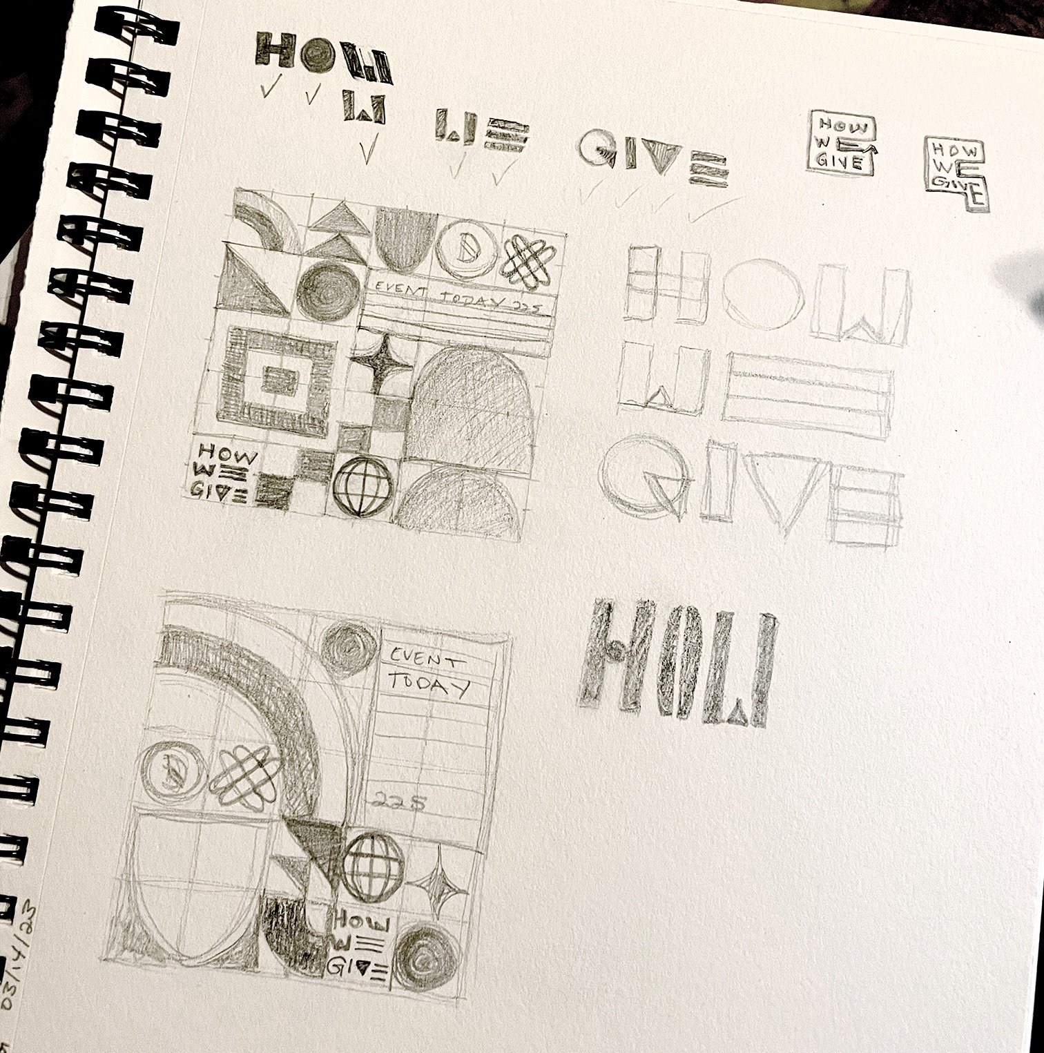
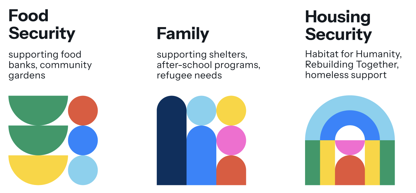
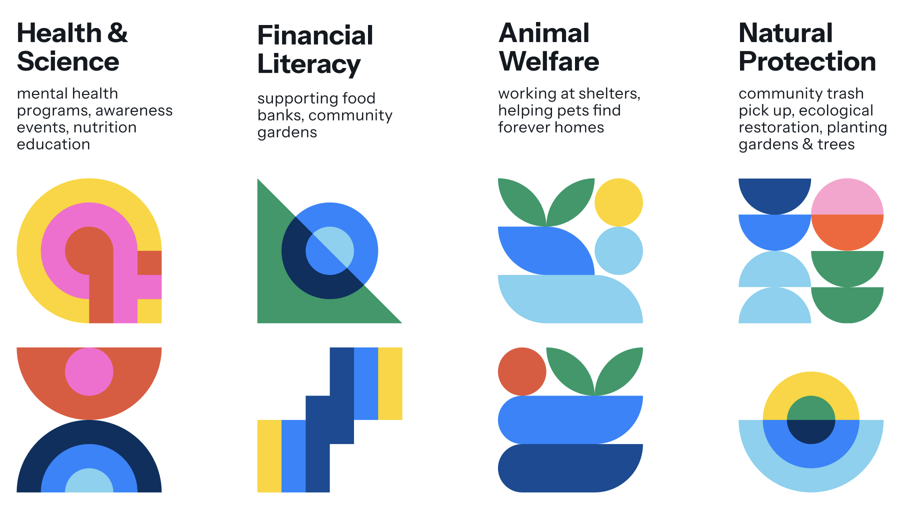
7 Pillars of How We Give
I used a consistent grid to build shapes that resemble elements of each theme.