Investopedia American Dream Builder
Ellie’s role: CREATIVE DIRECTION, PRODUCT DESIGN
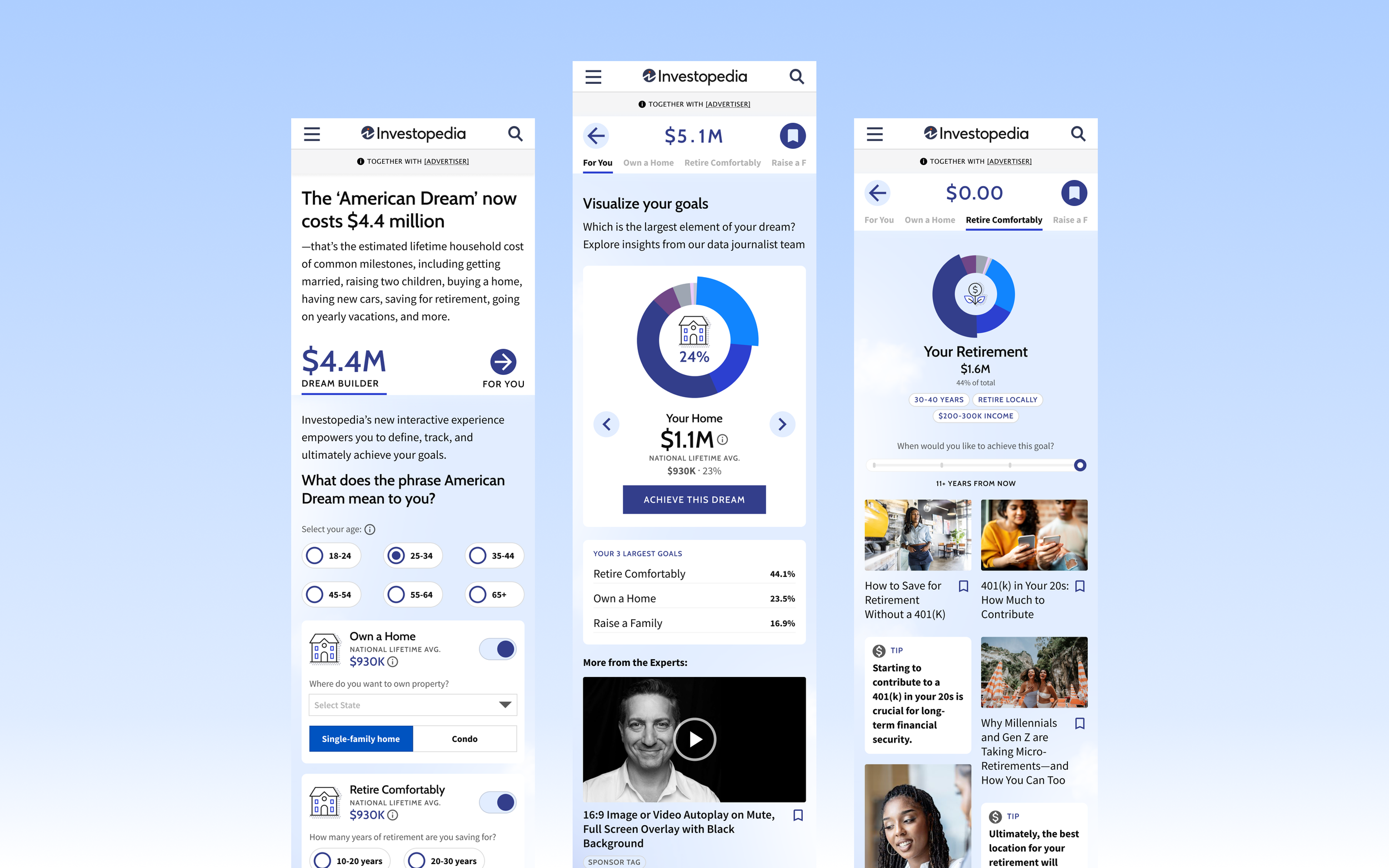
Rooted in Investopedia’s proprietary survey on the Cost of the American Dream—which drove billions of media impressions—this product is designed to offer a partnership opportunity for integrated editorial & client content. The experience allows users to take a deeper dive into the survey results with personalized calculations and content, to turn lifelong goals into small, actionable steps forward. While this project has not been built yet, a screen recording of the prototype shows the intended user experience.
Content Architecture and User Flow
Investopedia’s editorial team came to us with a matrix of questions and data across 7-8 categories identified by their research. We strategized on how to guide users through all the information needed to complete the calculator personalization, without creating user fatigue.
Our first design displayed each question at full-stage, but with a total of 18 questions across the different goals—not all of which are required to “build your own American Dream”—we wanted to give users more visibility earlier on in the experience. Compared to filling out a form towards a known goal or specific service, we knew this experience would be unfamiliar to users, and they might not care enough to complete the process. For example, the Lemonade App guides users through a detailed process of steps towards personalizing and calculating their insurance policy: the user is motivated to continue by their ability to perceive the end point, and understand the purpose of the questions they’re being asked.
Based on this concern, as well as the performance of other ad products at the company which used similar progressive disclosure and interstitial-style steps towards content syndication, the team opted to look for a solution closer to responsive enabling, which would allow the user more flexibility at all points of the experience. We decided to design the experience as a dashboard rather than a questionnaire, to allow more fluid user flow throughout the experience.
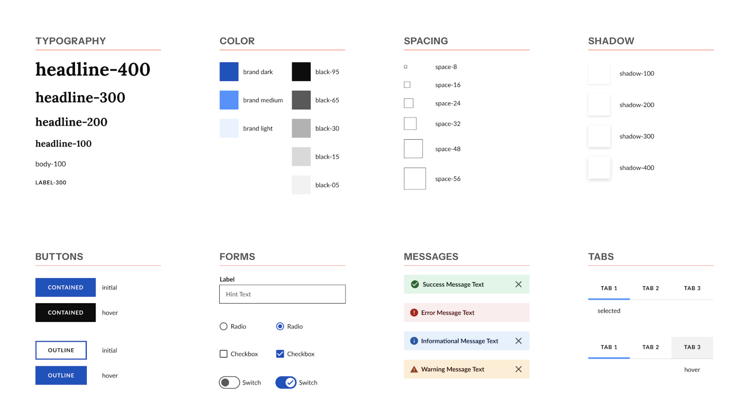
UI & UX Design Strategy
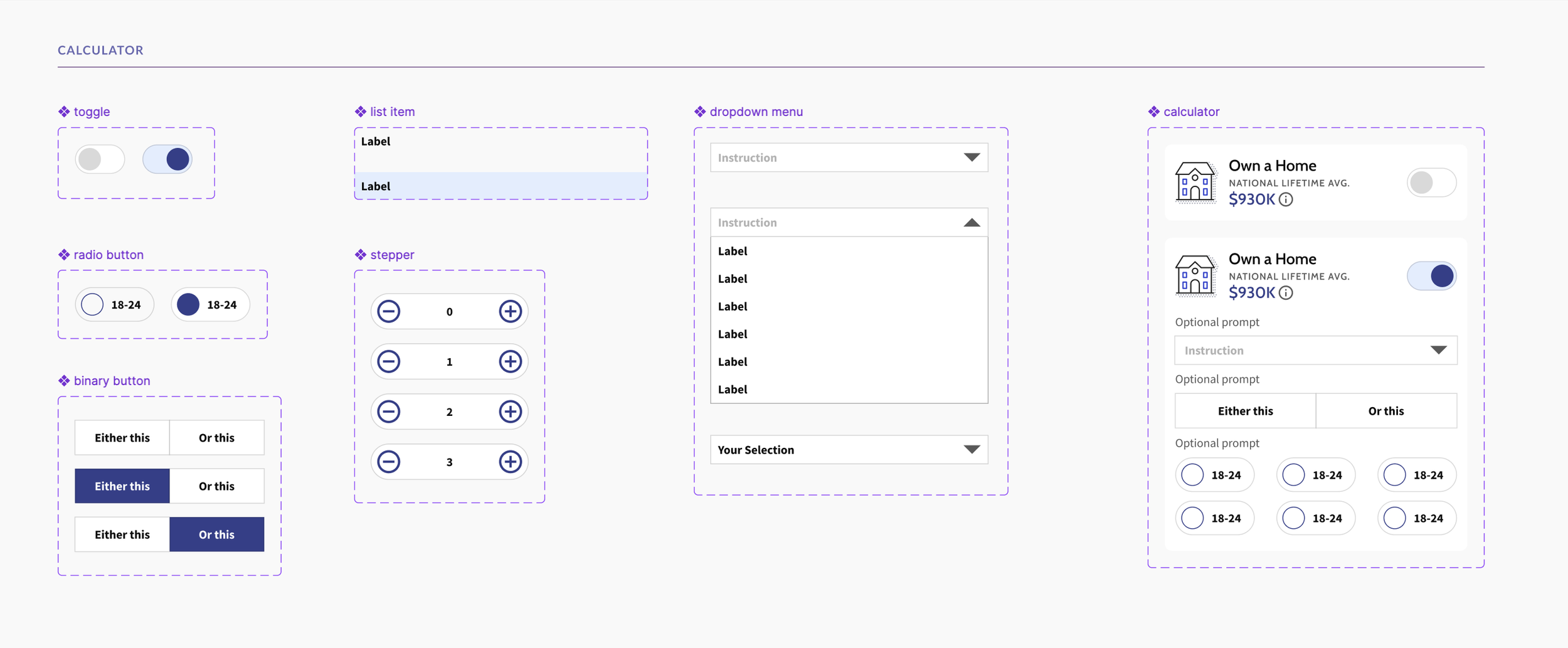
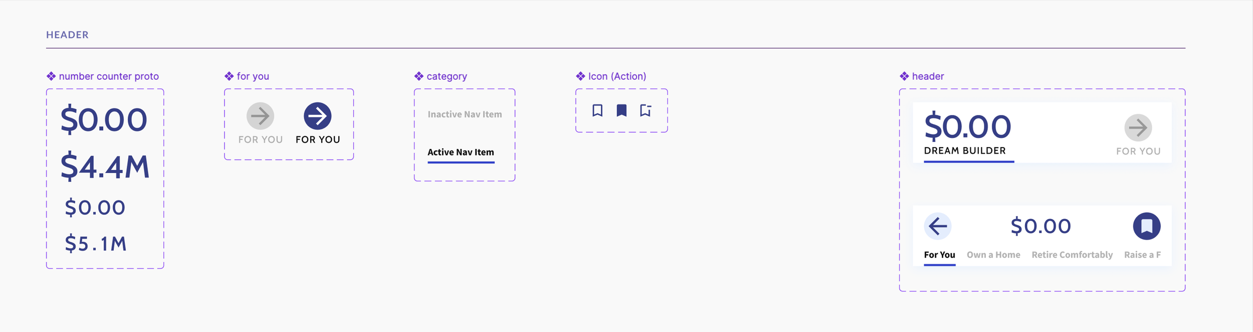
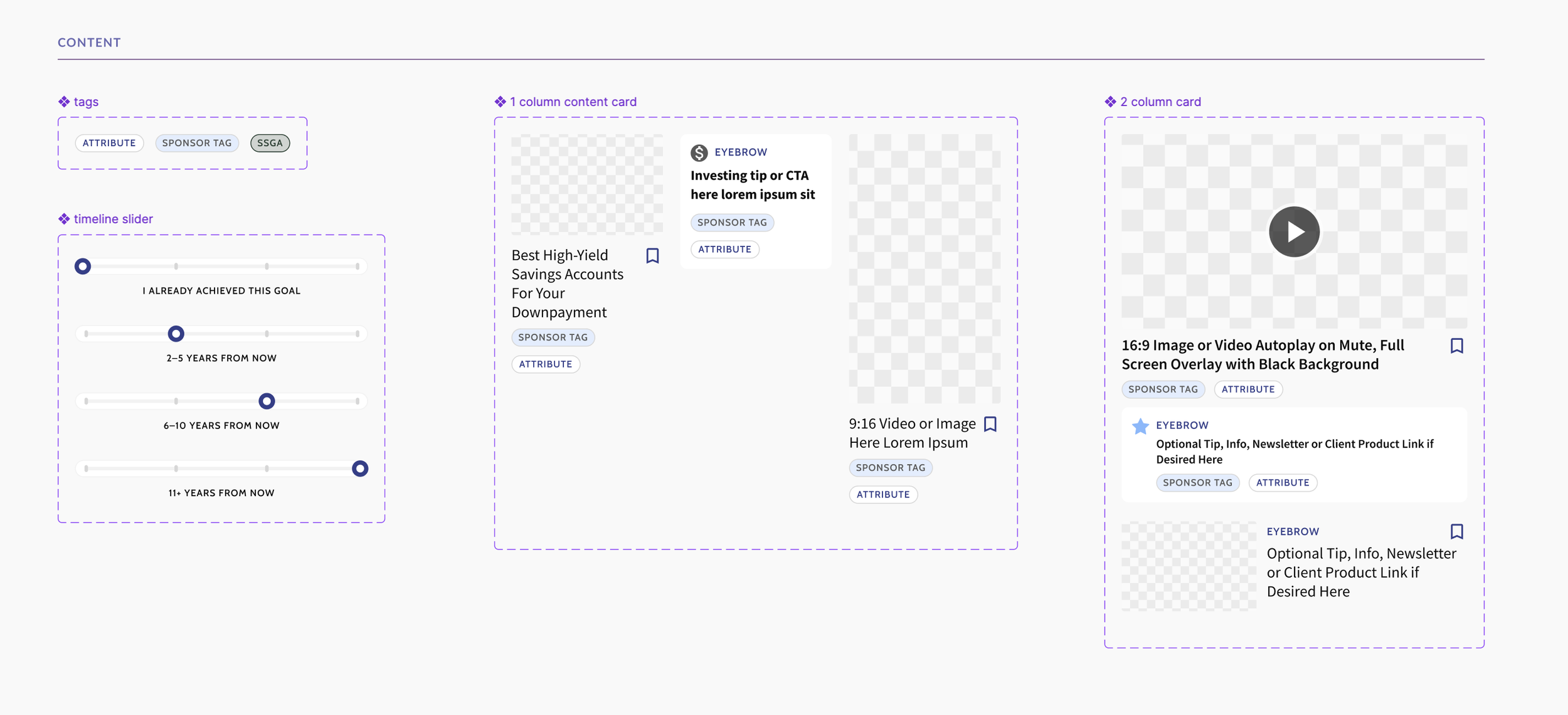
Investopedia’s design system exists in the context of the greater People Inc. base mapping—a shared design system across 40+ brands called Meridian.
We used the Investopedia brand collection from the design system to build out additional components for the dashboard so that it would fit visually in the Investopedia ecosystem, but allow the tool to feel elevated and exciting to both users and advertisers.
Meridian Base Atoms